 by
by AI can generate a slide deck quickly, but professional presentation design still depends on visual hierarchy. The audience should know where to look first, understand the message within seconds, and see evidence presented in a form that is easy to compare. A deck filled with polished templates can still fail if every slide has too much text or no clear visual priority.
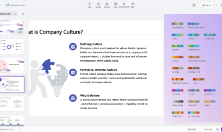
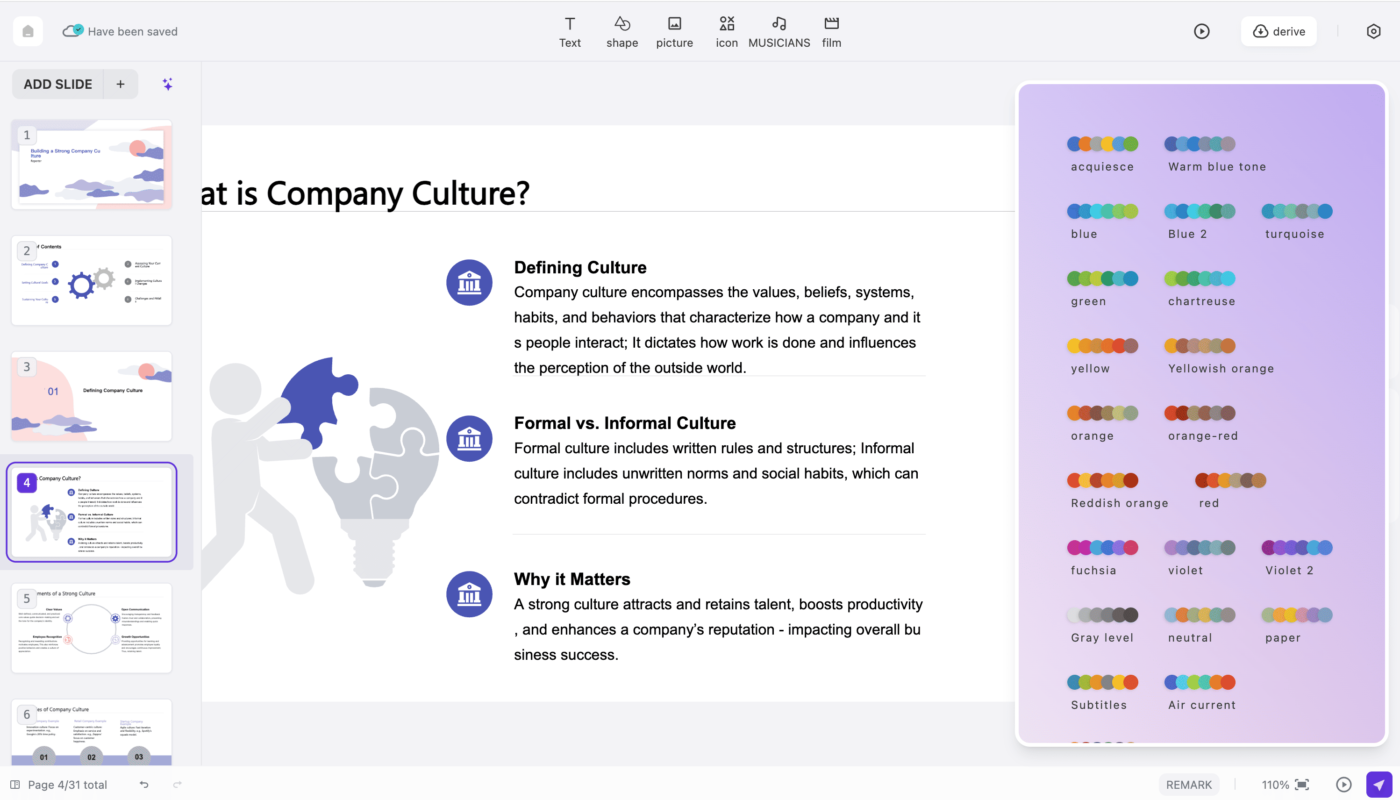
This guide focuses on the design layer: how to turn AI-generated content into readable, consistent, accessible slides. Tools such as Copilot in PowerPoint and Canva’s AI presentation features can help draft or restyle slides, but the design principles below remain useful regardless of platform.
One Slide, One Main Message
A strong slide should answer a simple question: what should the audience remember after seeing this slide? Use that answer as the title rather than a vague label.
Weak title
Customer Retention
Stronger title
First-90-Day Churn Accounts for Most of the Retention Gap
The stronger title gives the audience the conclusion before they study the chart or supporting details.
Build a Clear Visual Hierarchy
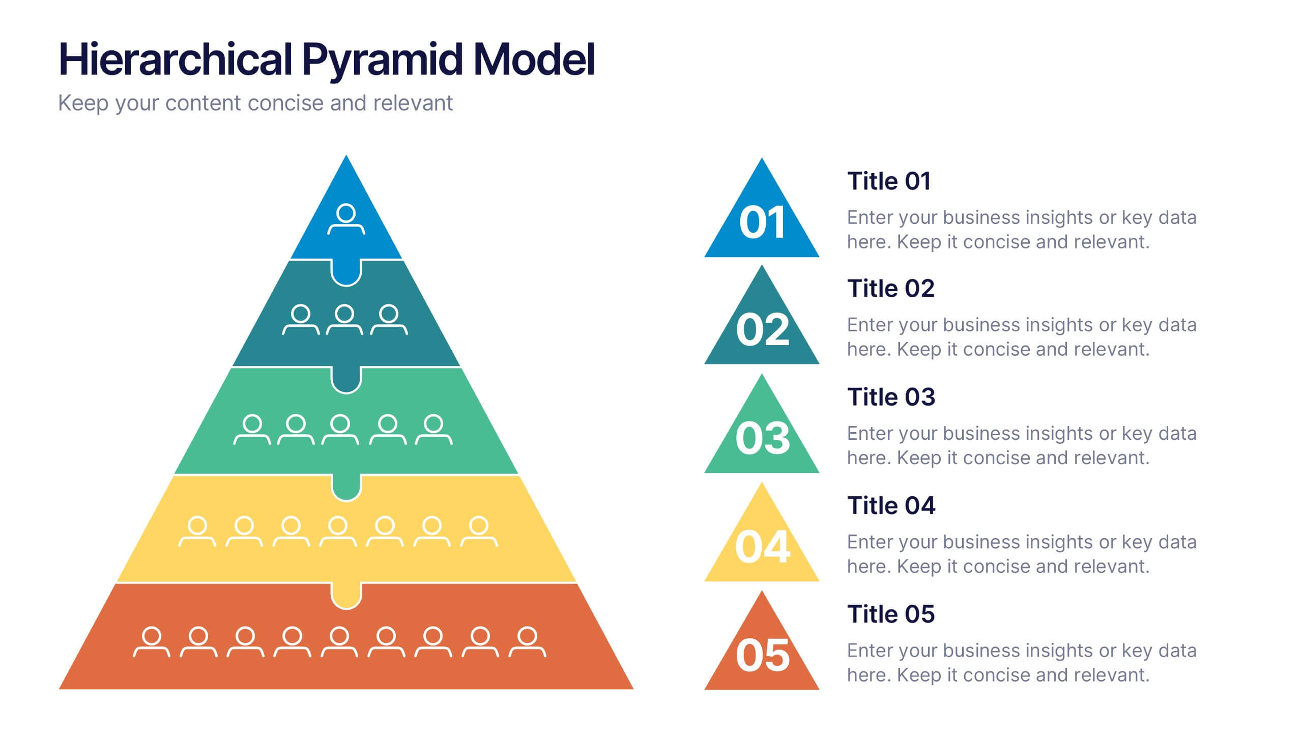
Hierarchy tells viewers what is most important. It comes from size, position, contrast, spacing, and repetition.
A practical order
- Main message or slide title.
- Primary chart, image, number, or diagram.
- Short supporting explanation.
- Source, footnote, or secondary detail.
If five objects look equally important, the audience has to decide where to start. Use fewer elements and make the priority obvious.
Use Layouts, Not Random Object Placement
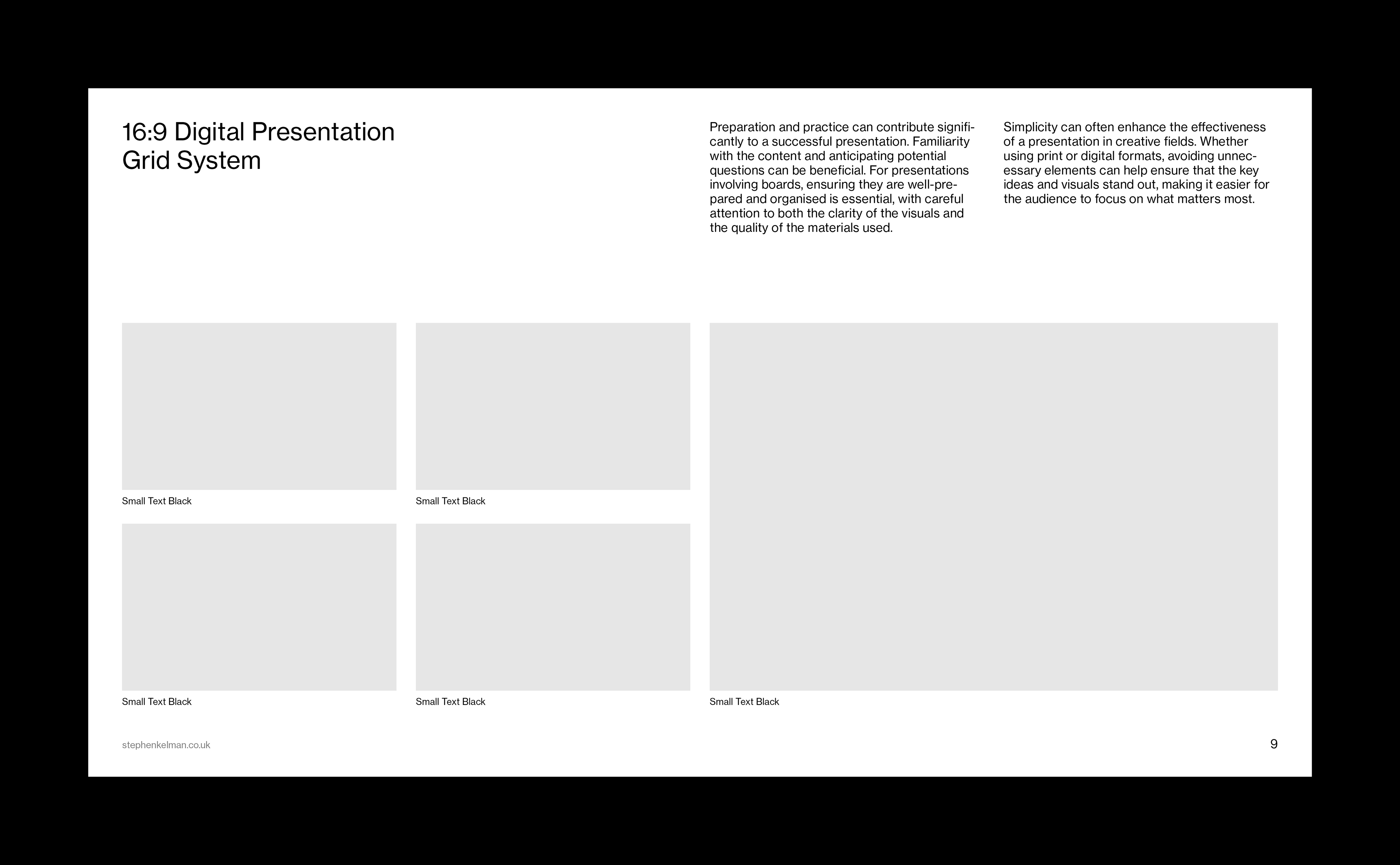
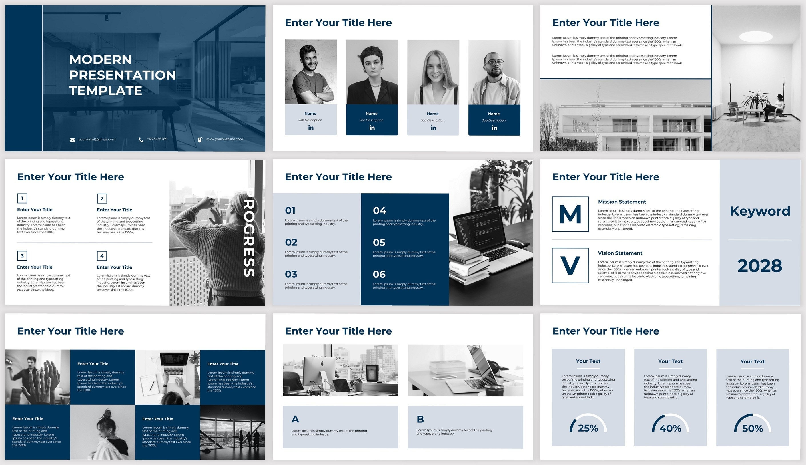
Professional decks feel consistent because objects align to a repeatable grid. PowerPoint templates and Canva layouts can speed this up, but AI-generated slides should still be checked for alignment.
Reliable layout patterns
- Headline + full-width visual.
- Headline + two-column comparison.
- Headline + key number + explanation.
- Headline + three-step process.
- Headline + chart + takeaway panel.
- Section divider with minimal content.
Use a small number of patterns throughout a deck. Consistency makes new information easier to process.
Typography: Make Slides Readable From a Distance
The correct font size depends on the room, screen, device, and layout, so rigid rules are less useful than testing. A practical test is to view the slide at normal presentation distance or reduce the deck to thumbnail size. If important text becomes unreadable immediately, the slide likely contains too much.
Typography checklist
- Use one or two font families.
- Keep title and body styles consistent.
- Avoid long paragraphs on live presentation slides.
- Use bold selectively for emphasis.
- Maintain sufficient contrast between text and background.
- Do not shrink source text until it is functionally unreadable.
Use AI to Condense, Not to Fill Empty Space
One of the best uses of AI is reducing text. Microsoft’s current PowerPoint Copilot documentation includes rewrite and condense capabilities. That is often more valuable than asking the tool to add extra content.
Ask AI to
- Turn a paragraph into one headline and three supporting points.
- Rewrite a title as a conclusion.
- Convert prose into a comparison table.
- Extract the three numbers that matter most.
- Draft speaker notes so detail can move off the slide.
Charts Should Explain, Not Decorate
| Question | Useful visual |
|---|---|
| How did something change over time? | Line chart |
| Which category is larger? | Bar chart |
| How do two options differ? | Comparison table or paired bars |
| How does a process flow? | Simple flow diagram |
| What are the parts of a whole? | Composition chart when proportions matter |
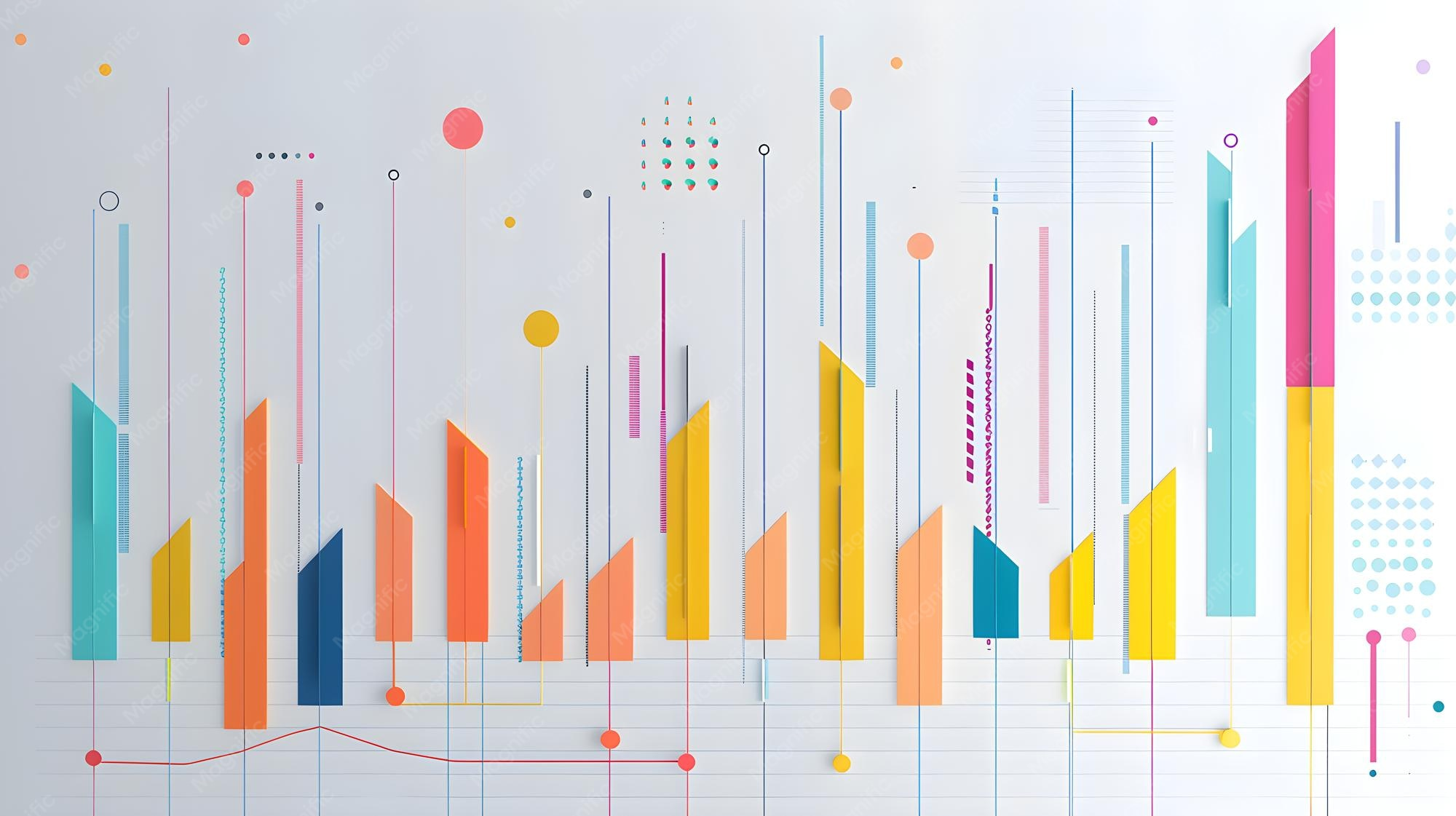
Build important charts from verified data rather than asking a generative image model to invent them. AI can help interpret or label data, but the plotted numbers should come from the actual source.
Use Images With a Communication Purpose
AI image generation can be useful when a concept needs an illustration and suitable photography is unavailable. Stock photography can be useful for real people, places, industries, or products. Screenshots can be best for software demonstrations.
Review generated visuals for
- Incorrect text or logos.
- Unrealistic hands, interfaces, equipment, or physical details.
- Misleading depictions of real events or people.
- Inconsistent brand style.
- Unclear licensing or provenance requirements.
Our guide on AI image generators explains how to evaluate realism and control.
Brand Consistency Makes AI Slides Look Intentional
AI slide generation becomes more useful when it starts from a strong template. Microsoft’s July 2026 PowerPoint brand guidance explains that Copilot can use template layouts and design elements to create more brand-consistent output.
Define a small presentation system
- Title slide.
- Section divider.
- Standard content slide.
- Chart slide.
- Quote or customer evidence slide.
- Closing/next-step slide.
Once these patterns are established, AI can help populate them without making every slide look unrelated.
Accessibility Should Be Part of Design
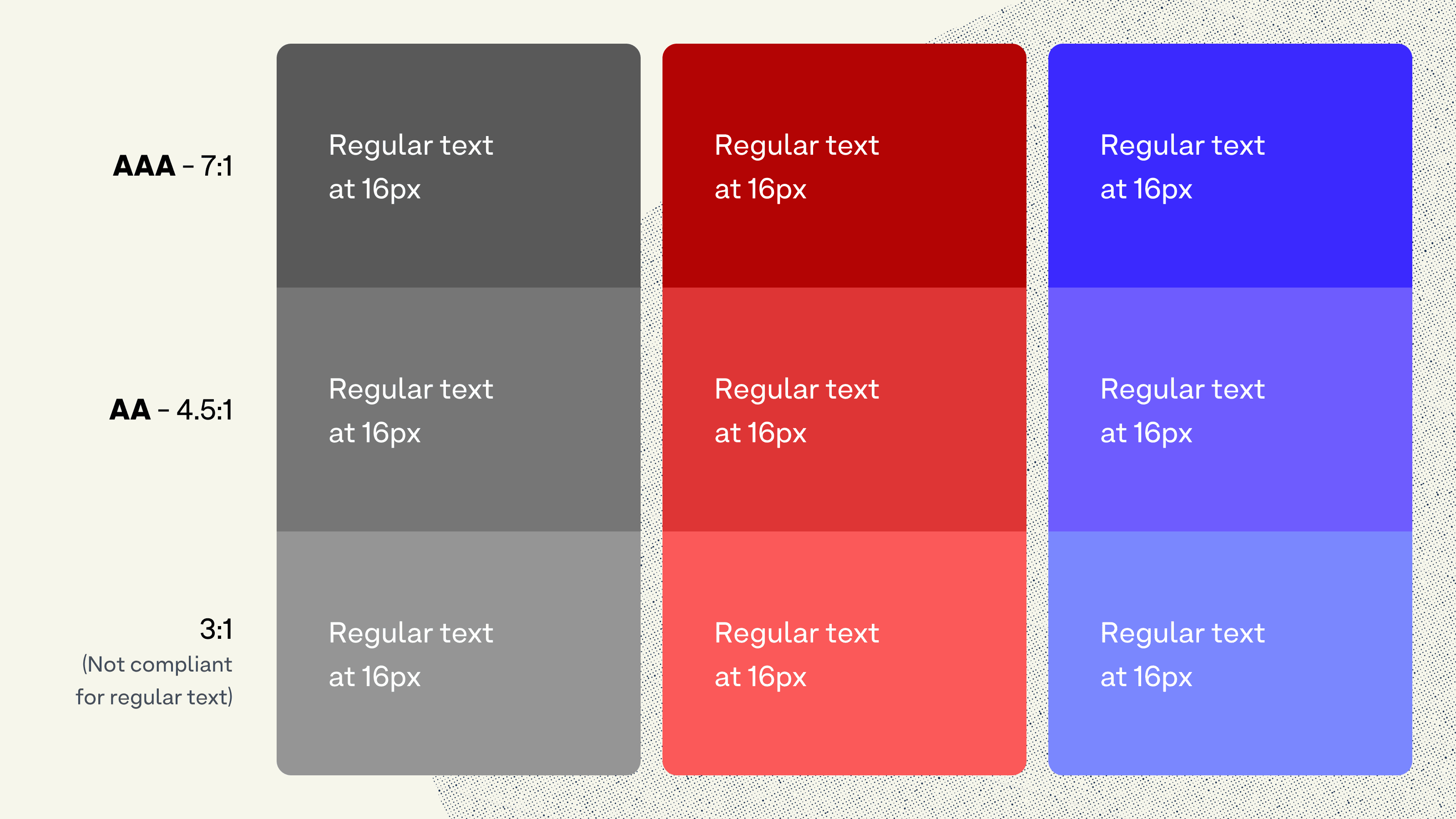
A professional presentation should be usable by as many people as possible. Accessibility also tends to improve general clarity.
- Use strong text/background contrast.
- Do not rely on color alone to communicate a difference.
- Add alt text to meaningful images when the file will be shared digitally.
- Use descriptive link text.
- Keep reading order logical.
- Caption video when appropriate.
- Avoid unnecessarily small text.
Presentation software includes accessibility-checking features; use them before final delivery rather than treating accessibility as a last-minute edit.
Speaker Notes Are a Better Home for Detail
Live slides should support the speaker, not duplicate the speech. Move background facts, caveats, source details, and talking points into notes where they do not compete with the visual message.
Microsoft’s current Copilot workflow can also create or work with presentation content and notes when turning files into presentations. AI-generated notes should still be reviewed for accuracy and the presenter’s natural speaking style.
Presentation Design QA Checklist
- Every slide has one dominant message.
- Titles state conclusions where possible.
- Objects align to a consistent grid.
- Typography is readable and consistent.
- Charts use accurate source data.
- Visuals support the message.
- Brand colors and layouts are consistent.
- Sources and footnotes are readable.
- Accessibility has been checked.
- Animations and transitions are restrained.
- Speaker notes contain needed detail.
- The deck works in the final export format.
For the full client-delivery process, see our client-ready AI presentation workflow.
Frequently Asked Questions
Can AI design a professional presentation automatically?
It can generate a strong starting point, especially when given a good template and source material. Human review is still needed for hierarchy, accuracy, brand consistency, accessibility, and the final narrative.
Should every slide use an image?
No. A slide should use the format that communicates its message best. Sometimes one number, a simple chart, or a short comparison is clearer than a decorative image.
How do I make AI-generated slides look less generic?
Use a custom template, specific slide-level instructions, real client data, a consistent image style, and conclusion-based titles. Generic prompts usually produce generic designs.
Conclusion
AI can make presentation design faster, but professional slides still follow familiar principles: one message per slide, clear hierarchy, consistent layout, readable typography, accurate data, purposeful visuals, and disciplined branding.
Use AI to shorten copy, propose layouts, generate initial visuals, and accelerate repetitive editing. Then apply human design judgment so the final deck feels deliberate, accessible, and easy to understand.